Skincare branding
Calypso is a skincare company whose target audience are young people who enjoy spending time in nature, are accustomed to social media trends and have an interest in astrology. Their purchasing habits involve, along an interest for the quality of the product, the brand aesthetic presentation.
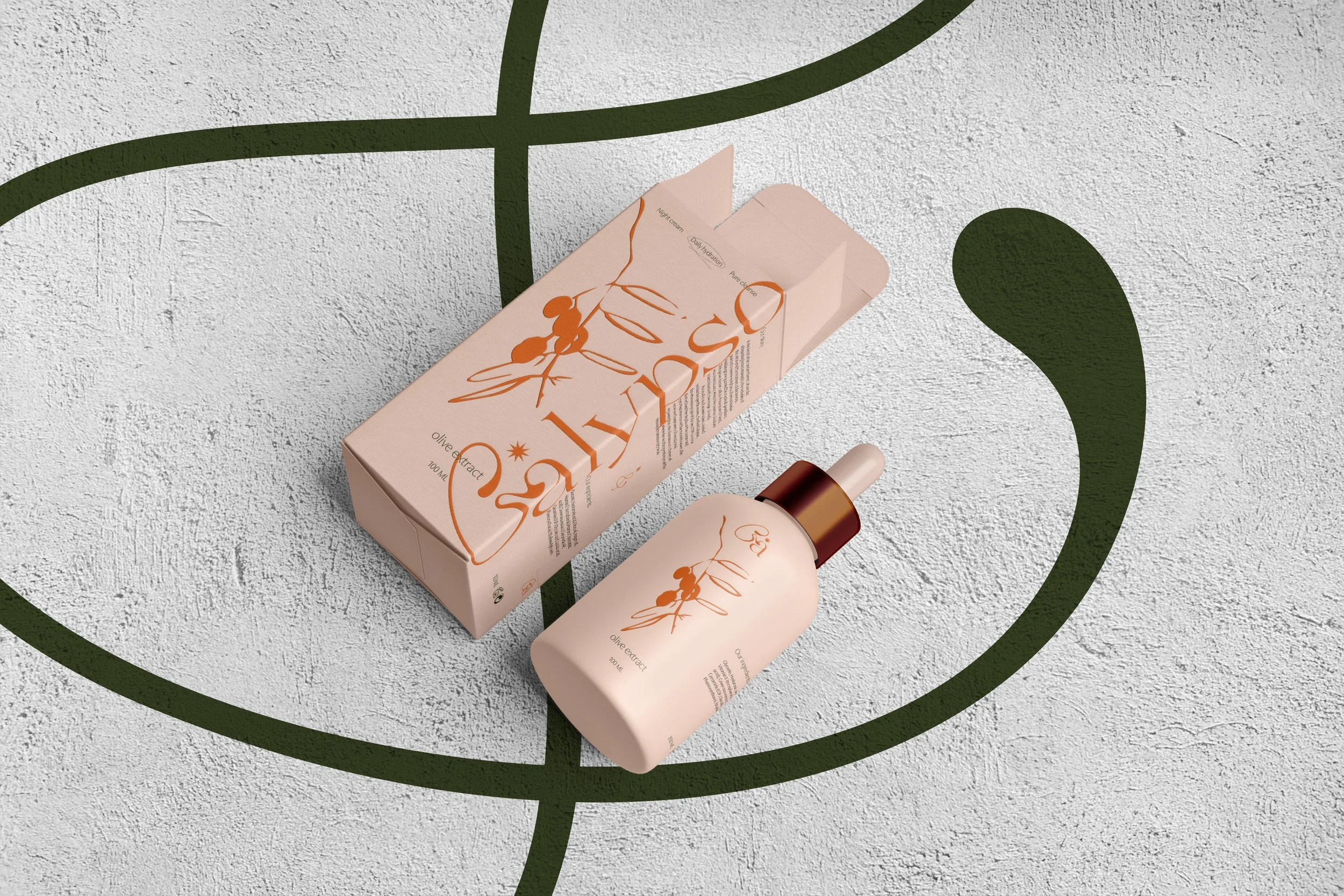
The visual direction is taking the product into a vibrant summery atmosphere by using warm yet balanced colours that are inviting and fresh.
The logo mark includes amorphous symbolism that links the brand to nature and its processes while the packaging blends the contemporaneity of the logo with a classic yet premium typographic emphasis.
Design process

Mood board simulating the creative direction


Design direction