Art direction and design for an independent magazine
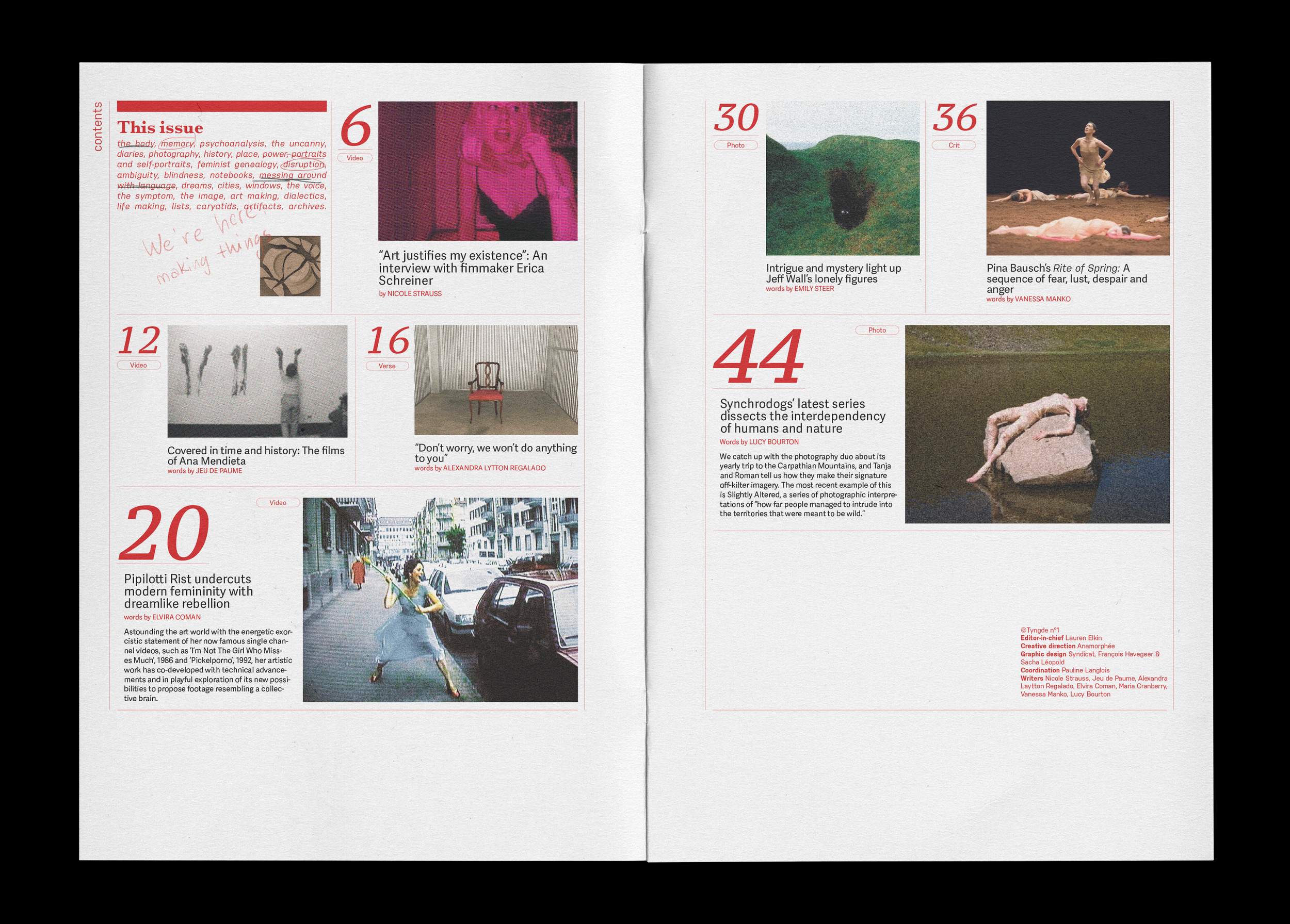
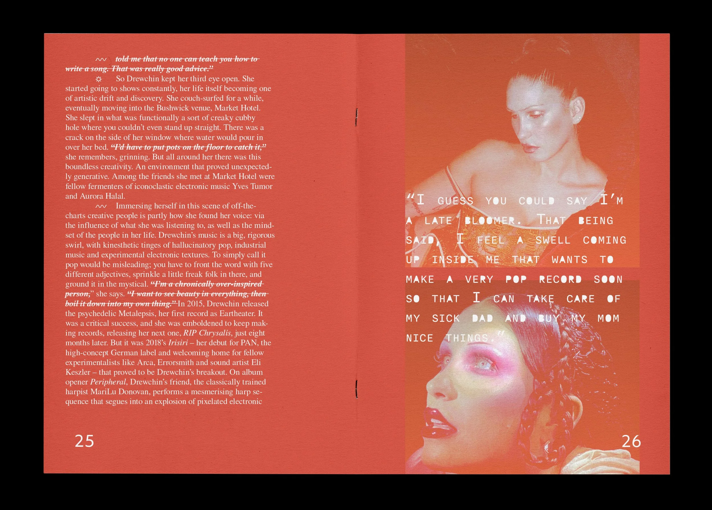
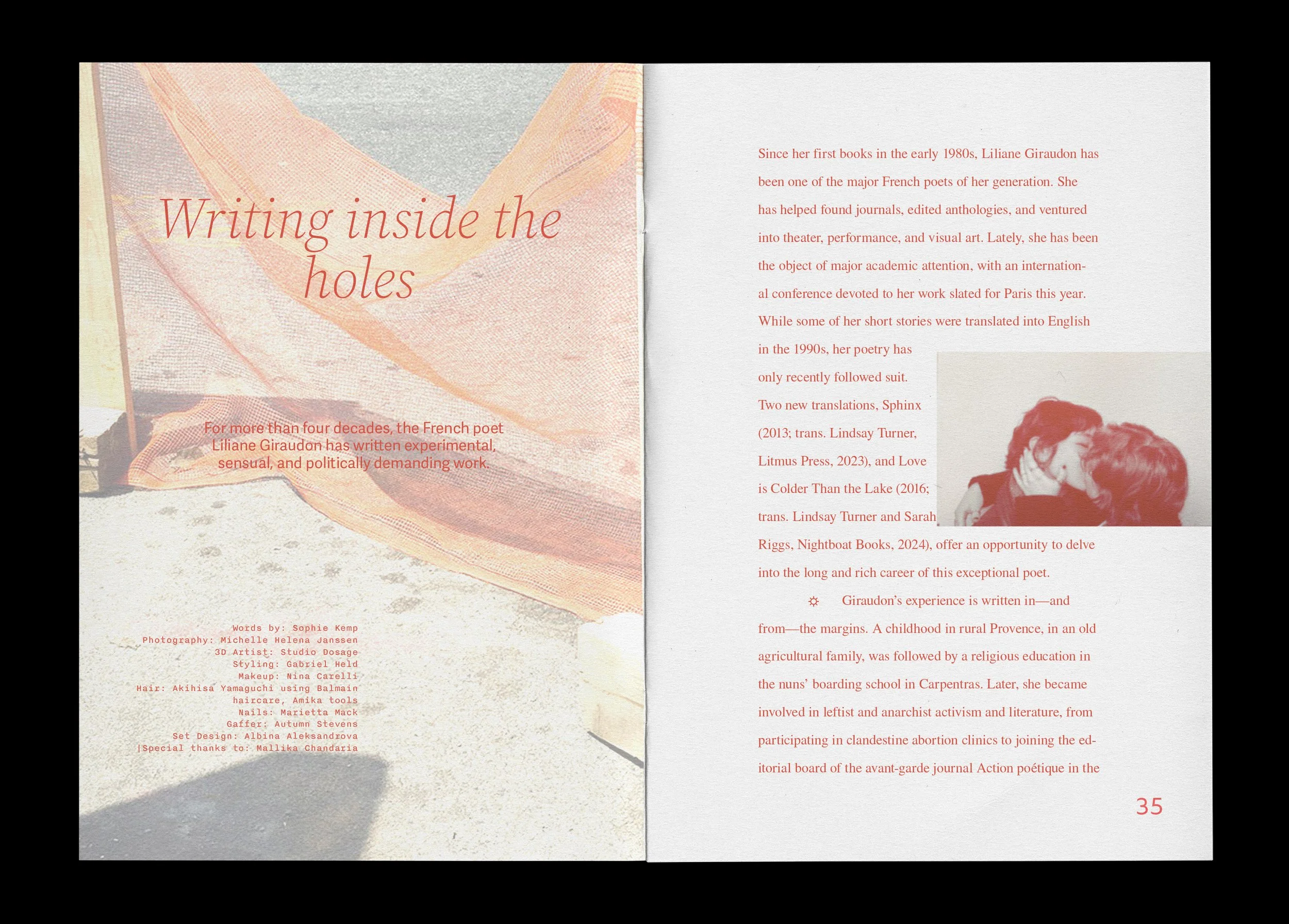
Tyngde means ‘weight’ in Norwegian and it’s the title of my proposed independent magazine for an university project. The title is taken from Emmatell’s poem Din tyngdekraft (Your weight) which talks about the sensory experience of verbal language, exploring the gap between the sound heard and words in their written form inscribed on a surface:
the way the composition of vowels and consonants
flowed,
slipped,
slipped away,
across your lips
tore at me so far inside
that it could hardly be felt.
– Din tyngdekraft
I interpreted these lines as relating to the sensory experience of visual art which is able to transform us from within, without us even noticing it at first.


